I'm John Death, he's Jack Mask.
We fight crime.
What's the plot of Death Mask?
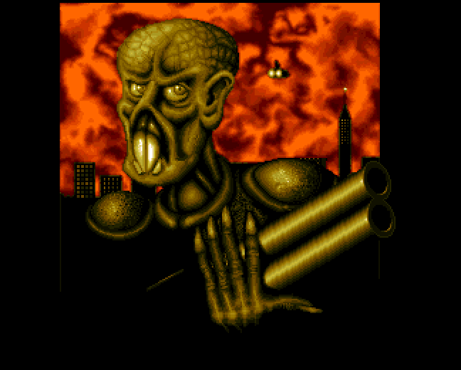
No text at all this time, just that one picture.
The attract screen is a slideshow of over a dozen pictures of ingame graphics. I hope that these pictures are being rendered on the fly using the game engine rather than storing them as pictures, otherwise that's a LOT of disk space used there.
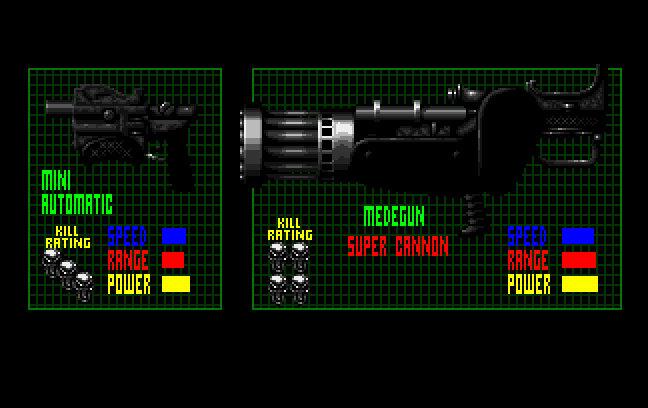
I'll be sure to keep an eye out for the fearsome Medegun Super Cannon with its KILL RATING of FOUR SKULLS, but I do like the cut of the Mini Automatic's jib, even though it only has a KILL RATING of THREE SKULLS. Single-handed PDWs all round!
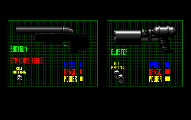
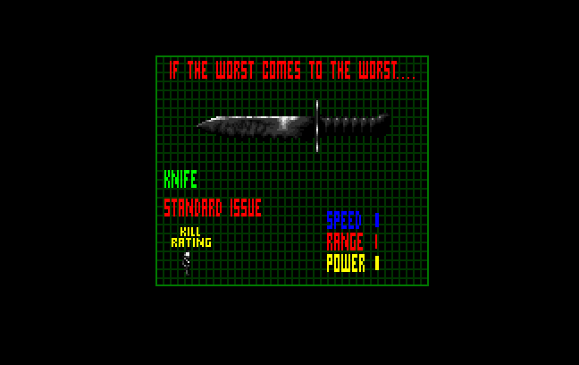
Turns out ol' Mr. Mask isn't a purpose-built Robot Wars-esque pneumatic hydraulic 200,000-pounds-per-square-inch stabber robot like modern day heroes.
I'm trying to get pumped up for this, but the game isn't making it easy. Eerie music on the title screen, no music in-game, the Death Mask logo from the title screen on the (frequent) loading screens and now a less engrossing mission briefing than Gloom's one line intros. I suppose there's nothing wrong with a game that takes itself seriously and avoids both 'macho' and 'ironic macho' in its text, but I'd at least like to see a picture of where I am or who I'm fighting against.
The first thing that's glaringly obvious about Death Mask is that it's supposed to be played as a split-screen co-op game. (Which I'm not doing.) It's also got a versus mode. (Which I'm not playing.)
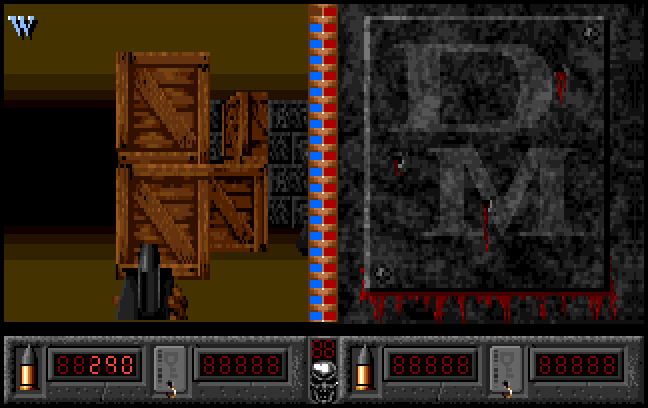
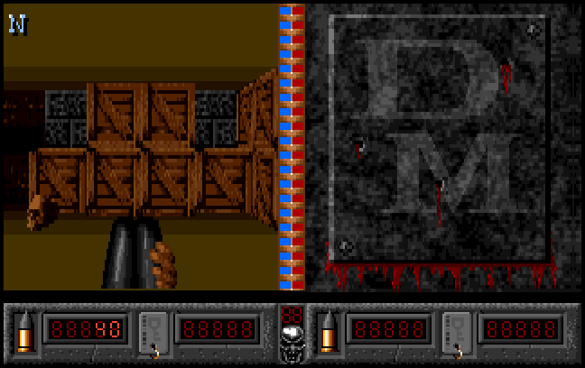
You're playing this with a one button, eight-directional joystick. To get around this stack of crates, I'm going to have to twitch left quickly to turn left, twitch forward to step forward exactly one cell and then twitch right to turn right again. Hold any direction for too long and I'm way off.
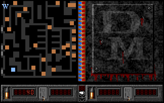
Those orange squares are enemies. They're buzzing around the place like bees... which means no pause on the map screen! Makes sense for a co-op game. I would have put the map on Player 2's side of the screen when playing single player, but I guess that could be considered cheating. The game might also allow arcade-style Player 2-joined-the-game interruptions.
I'm seeing quite a few Z shaped corridors in here. They're not gonna be fun to navigate.
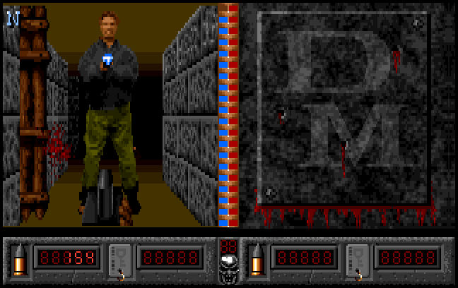
My guy is relatively blasé about getting shot, but this enemy guy lets out a loud "OHHH!" whenever he's hurt. A couple of seconds of automatic fire and he's dead. No death animation. He's instantly a mangled, bloody corpse.
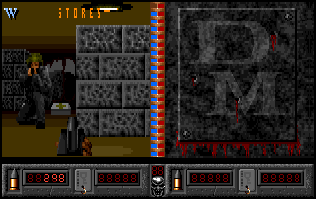
It seems the enemies are restricted by the grid as much as I am. This type of enemy permanently kneels on the spot so I can't wait for him to move into my line of sight. How am I gonna shoot this guy without giving him a few seconds advantage while I twist and turn into position?
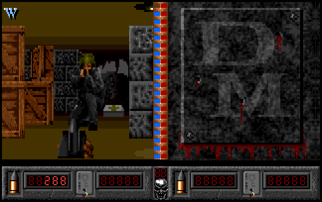
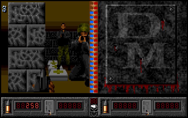
If there's an enemy in the corridor in front of me, I hold fire until they're gone. I've discovered that I can sidestep by holding down Forward or Backward and pulling left or right, but that's no good in a corridor that's as wide as I am. If I'm in a large room, I can retreat until my back is to the wall and use it to slide left and right. If an enemy wanders into any of the squares, I'll be jammed and have to turn around.
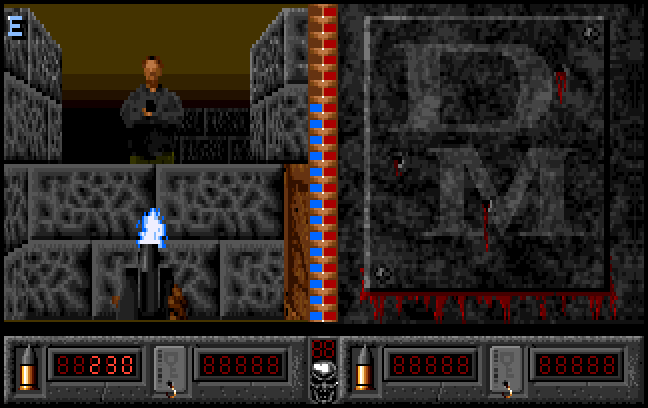
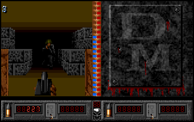
I'm desperately trying to find an interesting enemy, texture or object to show you, but there just isn't any!

Nope, this is just an ordinary window near the entrance to the level. Inexplicably as ever, pressing Escape instantly forfeits your current life.
Doom doesn't do it. As far as I know, none of the games preceding Doom did it. It's semi-understandable that a simultaneous console/computer game like Wiz 'n' Liz would have an instant reset button, with the Escape acting as the console's Reset button, but Death Mask is only a computer game.
Technically speaking, I can understand how it might be difficult to display a menu with transparent areas on top of the psuedo 3D scene. That doesn't explain why there isn't a menu that fills the entire screen or an opaque window in the centre of the screen (with the remaining visible areas of the 3D screens blanked if necessary), or, even simpler, a very simple horizontal menu that takes the place of the ammo counter at the bottom of the screen. You've specifically included a great big whocking static bar at the bottom of the screen so you can render less pixels and you're NOT USING IT. (And that's not counting the bottom fifth of the screen that mysteriously disappeared between the title screen and the gameplay.)
Unlike both Fears and Gloom, losing a life means all the enemies come back. Their overwhelming numbers are no match for my mastery of the cardinal directions. The actual exit is a featureless dead end corridor. There's no stairs, no sign, no window showing part of the next level, no door, no switch, no blinking light, no special floor tile. If I didn't have the map, I'd have no idea it was the exit.
COMPLETE
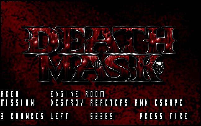
Is that my score in the middle?
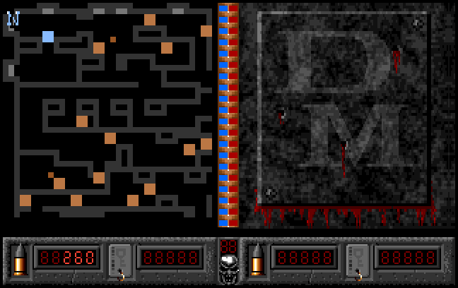
From above, this place looks like it would have some sort of useful structure to it and some useful landmarks which I can use to navigate.
No. Everywhere looks the same and you can't easily recognise places due to the unnatural camera. I spend half my time playing this game reading the map and memorising the sequence of steps I need to take to get to the next enemy or objective. The 3D view is useless for seeing where I am, its only use is movement. If I could move on the map screen, I would.
And then I would be playing Gauntlet. Ugh...
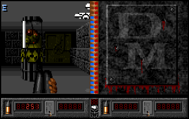
WAITAMINNIT! SHOTGUN?! I had the Mini Automatic on the last level! Where's the weapon switch key? The bastards took my guns away!
The slow firing, pathetic shotgun gradually saps the hit points of the reactor. It makes a loud, low-quality 'bang' and instantly disappears from view, leaving no rubble behind.
The barrels on the last level did exactly the same thing. They didn't even take any of my health off for standing too close when they exploded.
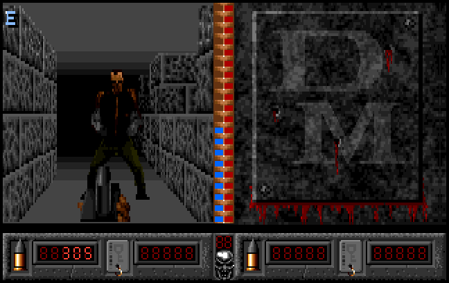
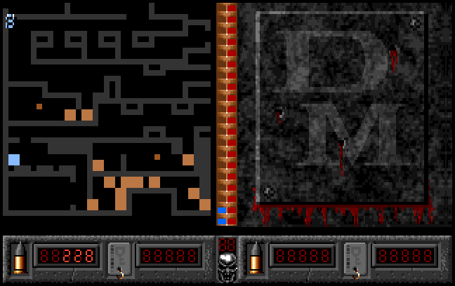
And I've missed a reactor to the North. TWO reactors, even. Bollocks.
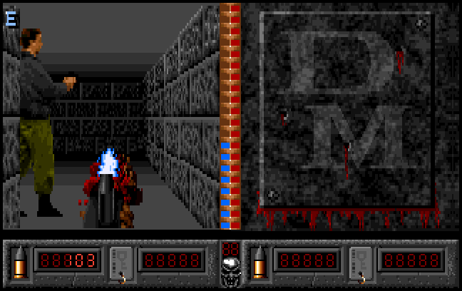
These guys have bizarre moving animations. Their two frame movement animation shows them running but they appear to move rather slowly, so I'm watching a room full of madly flickering silhouettes hop around the room.
I didn't get penalised for entering the Exit cubbyhole too soon, but I had to destroy the remaining reactors in order to finish the level.
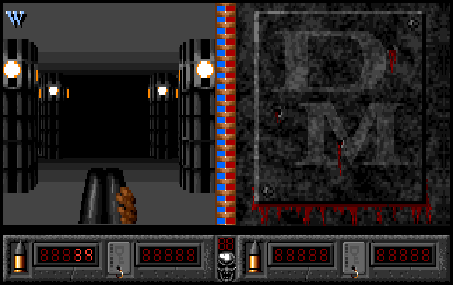
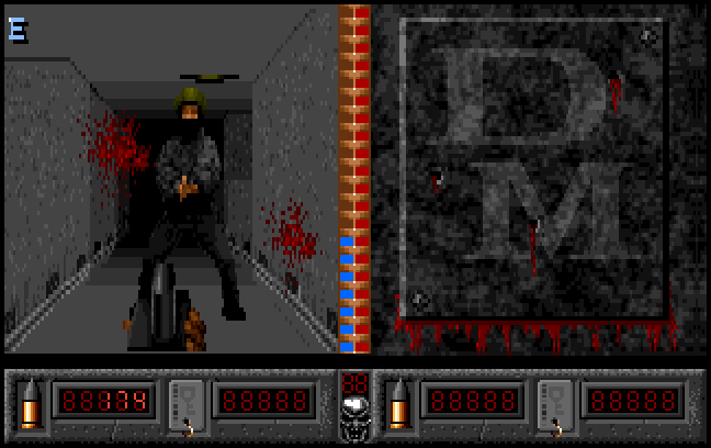
Nope. I don't even get a Game Over screen for my troubles.
Death Mask! It's no fun in single player due to the wacky tile based gameplay. Driving Death Mask's ridiculous robot gnome around the levels is frustrating enough as it is so I deliberately stopped before I ended up playing a level with any key-door fetching.
You might enjoy playing this game with a friend, but I would recommend you place it way, way, way down on your list of co-op games to play. Life's too short to play Death Mask.


I find it simply breathtaking that this game exists. I've watched footage and become sickly from interest as to how such a thing could be created and enjoyed. Great write-up.
ReplyDeleteThe CD32 version is slightly more playable due to the CD32 controller allowing you to strafe around. The ingame music is pretty good too.
ReplyDelete